INTO Mag
Editorial Design
2024
~ 6 months
team project
Client:
RUFA (Rome University of Fine Arts) x Mag to Mag
Details:
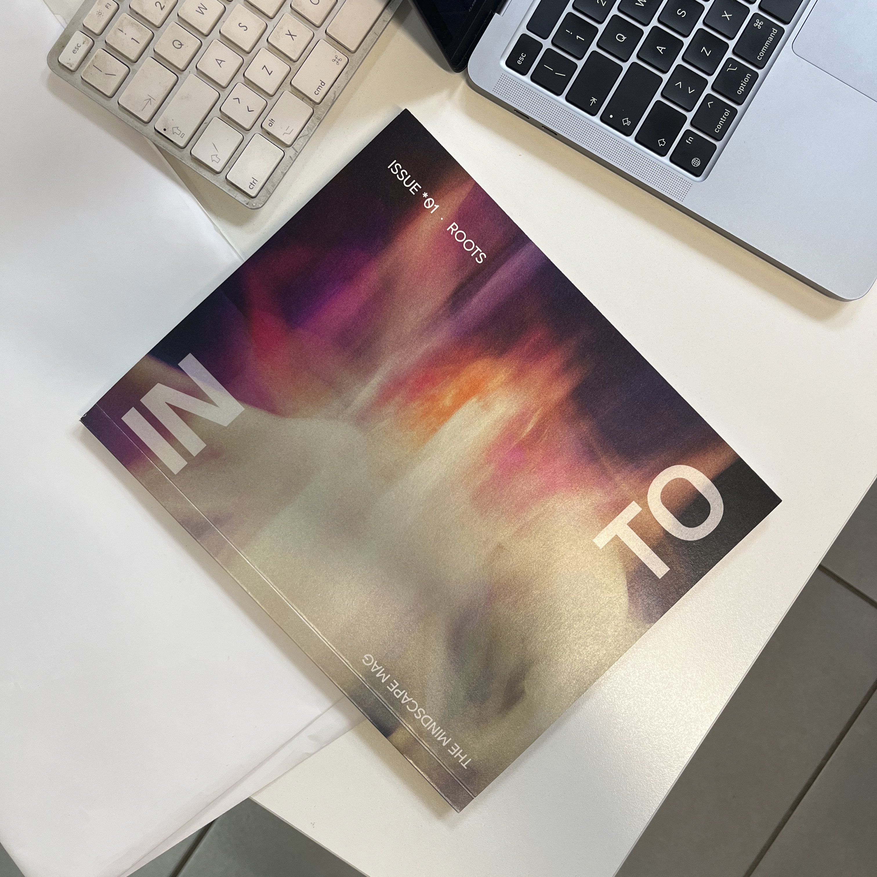
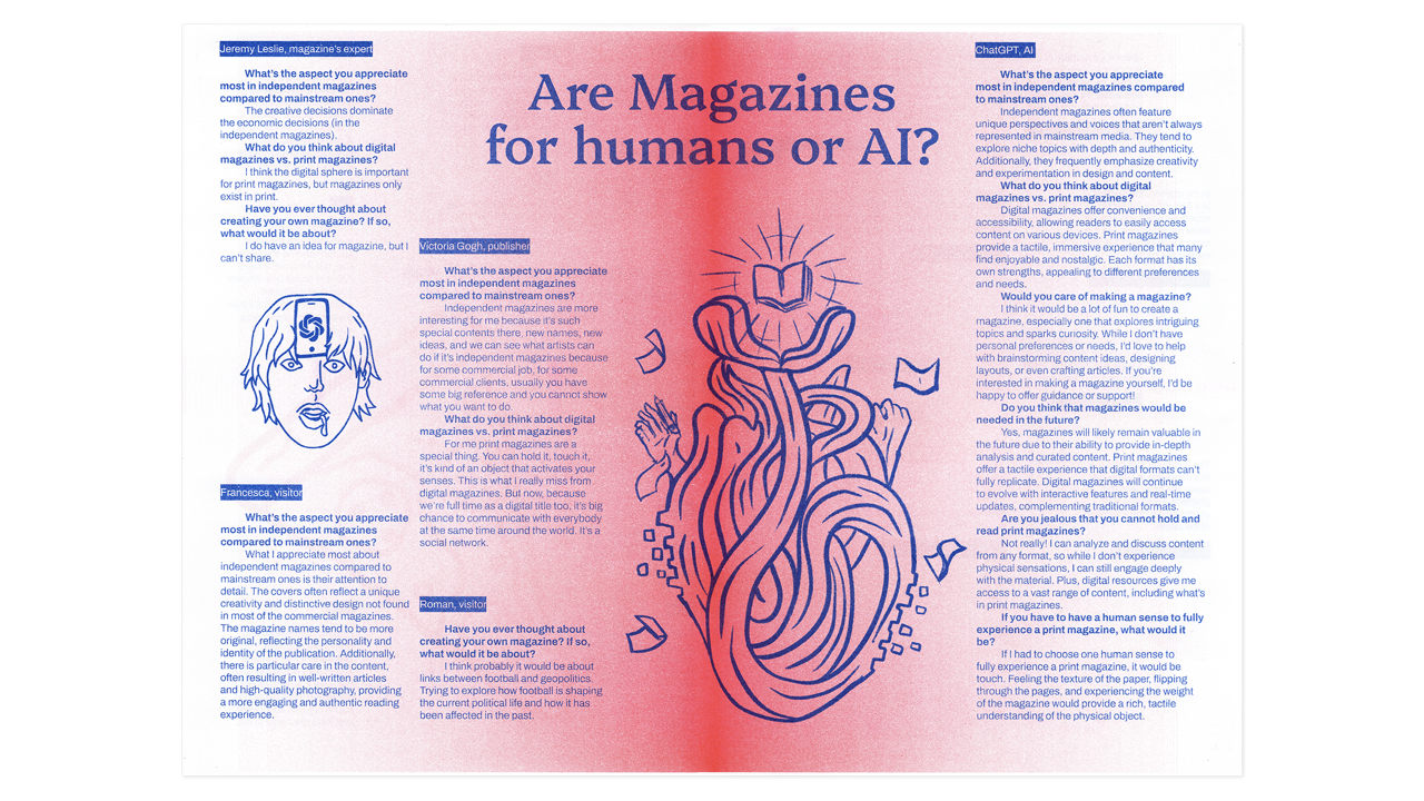
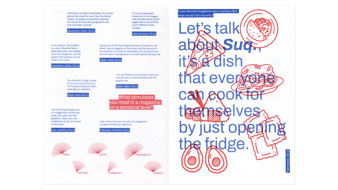
During my second year in RUFA, I worked with a team of four classmates to create a magazine named INTO for the Design Methodology course. The project explored the unconscious and mental landscapes through a deeply introspective journey.
INTO moves through the layers of human nature. It mixes visual storytelling with abstract texts and experimental layouts, building an immersive experience that invites the reader to get lost inside it.
INTO moves through the layers of human nature. It mixes visual storytelling with abstract texts and experimental layouts, building an immersive experience that invites the reader to get lost inside it.
Poster treccani emporium x rufa
poster design
2025
~ 6 months
Client:
Treccani Emporium x RUFA (Rome University of Fine Arts)
Details:
This project, developed in collaboration with RUFA Academy for Treccani Emporium, centers on creating a visual tribute to an Italian excellence: the craft of gelato. The design focuses on celebrating gelato not just as a dessert, but as a global icon of Italian artisanship and creativity. The poster design captures the ephemeral and mutable nature of the subject through a layered composition that utilizes a vibrant, saturated vintage aesthetic. The highly chromatic palette immediately evokes a sense of pleasure and almost sensual indulgence. Key to the visual tension is the deliberate contrast between elements of hot and cold, which opens the design to a more allusive and slightly irreverent reading. Crucially, the word “bollente” (boiling) is custom-drawn by modifying the Neon NBL typeface by CAST, a detail that underscores the craftsmanship and the conceptual irony of juxtaposing "hot" text with a "cold" subject. This visual strategy transforms an apparently innocent icon into a complex narrative that reflects Italian artistry while challenging its traditional image with a subtle, defiant edge.

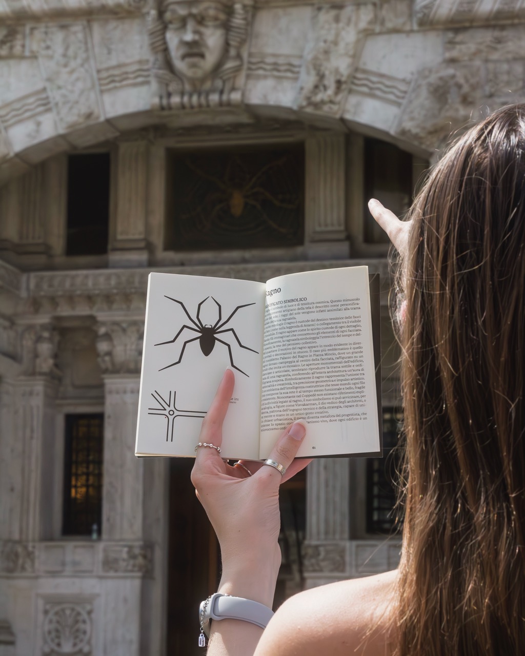
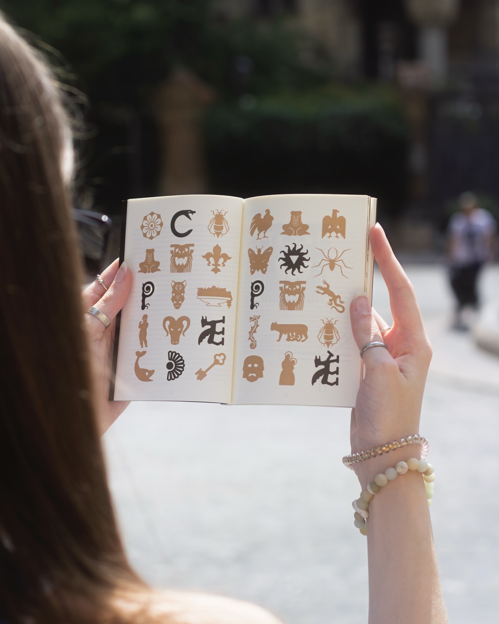
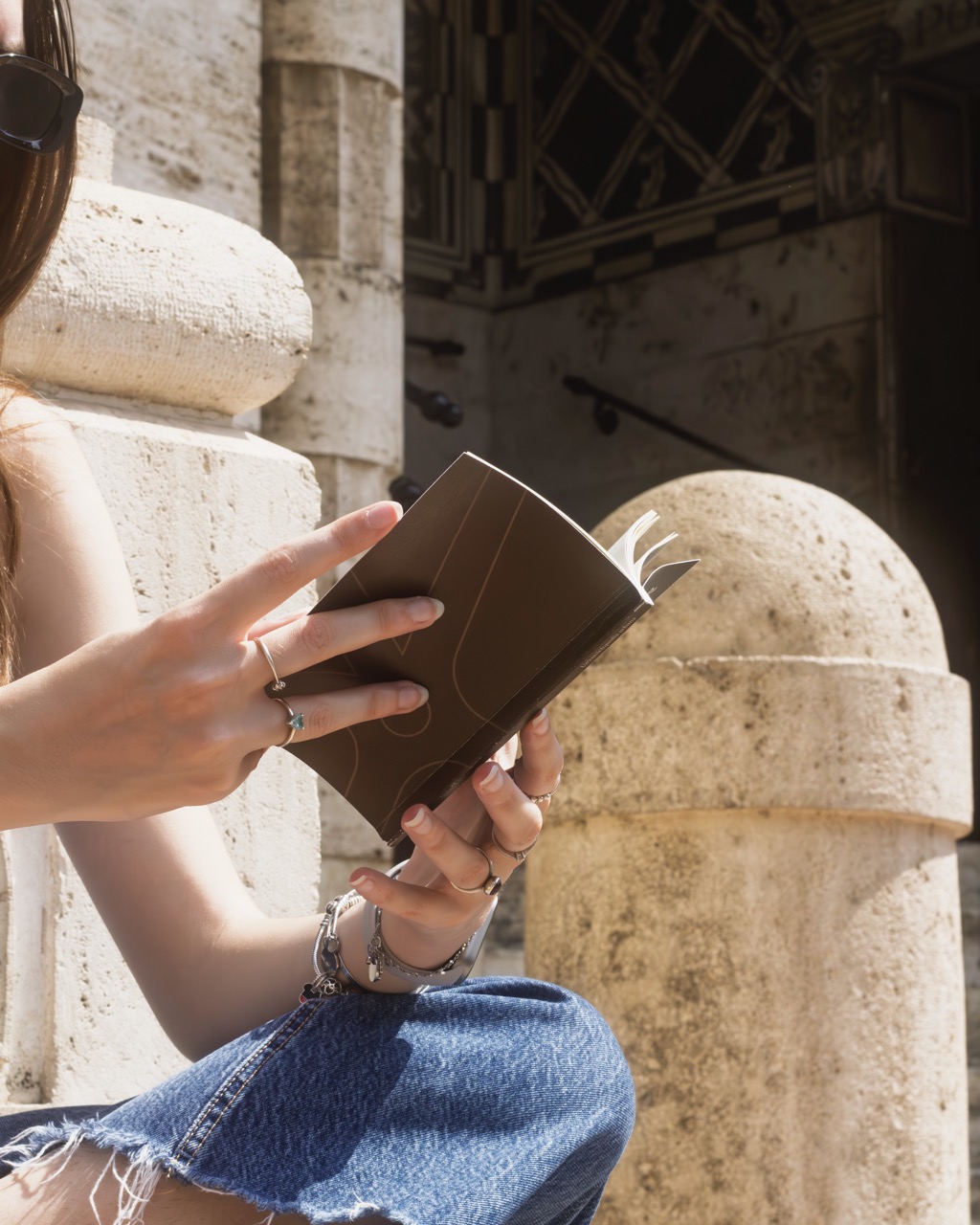
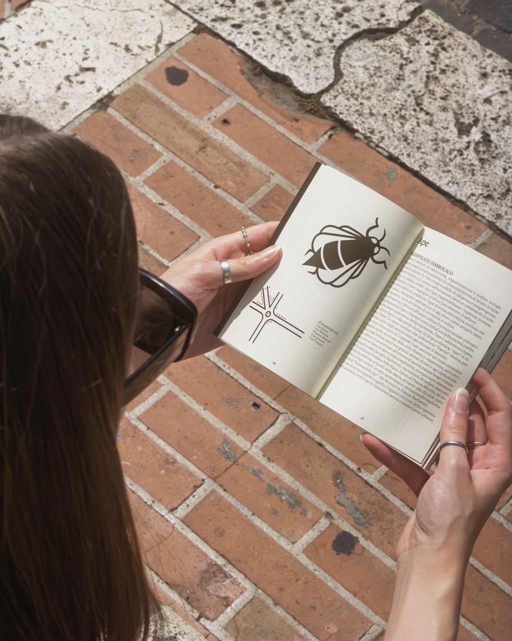
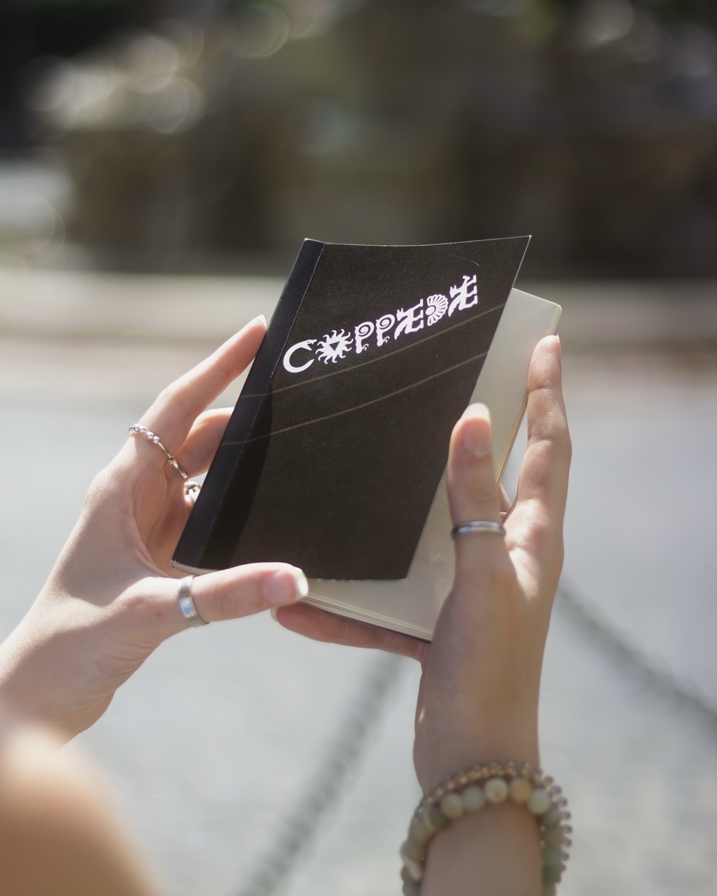
coppedè: un'enciclopedia urbana
editorial design
2025
~ 4 months
team project
Client:
RUFA (Rome University of Fine Arts)
Details:
We created this project to offer visitors an alternative guide to the Coppedè district, a unique area in Rome designed by architect Gino Coppedè in the early 20th century. Known for its blend of Art Nouveau, medieval, and classical influences, the neighborhood stands out for its dense and often mysterious symbolic language. To truly understand the deeper meaning of Coppedè, one must go beyond its striking aesthetics. The guide focuses on identifying and decoding the many symbols embedded in its architecture and decorations. Each one is paired with a short explanation that reveals its meaning and cultural background. A minimap allows readers to locate each symbol and navigate the district with greater awareness.The result is a compact and accessible tool for exploring Coppedè through its symbols.
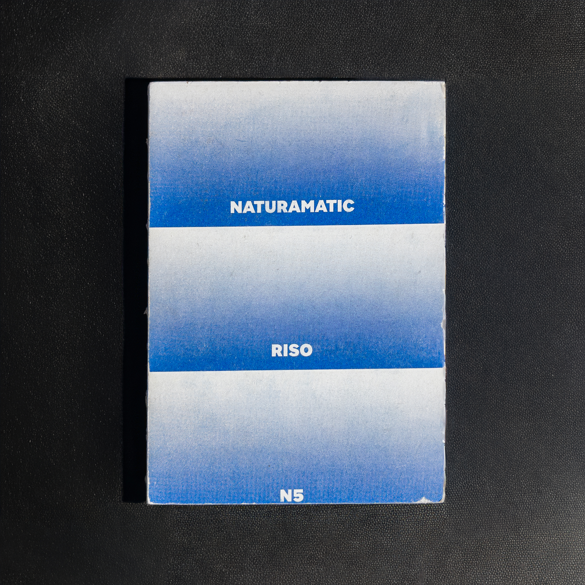
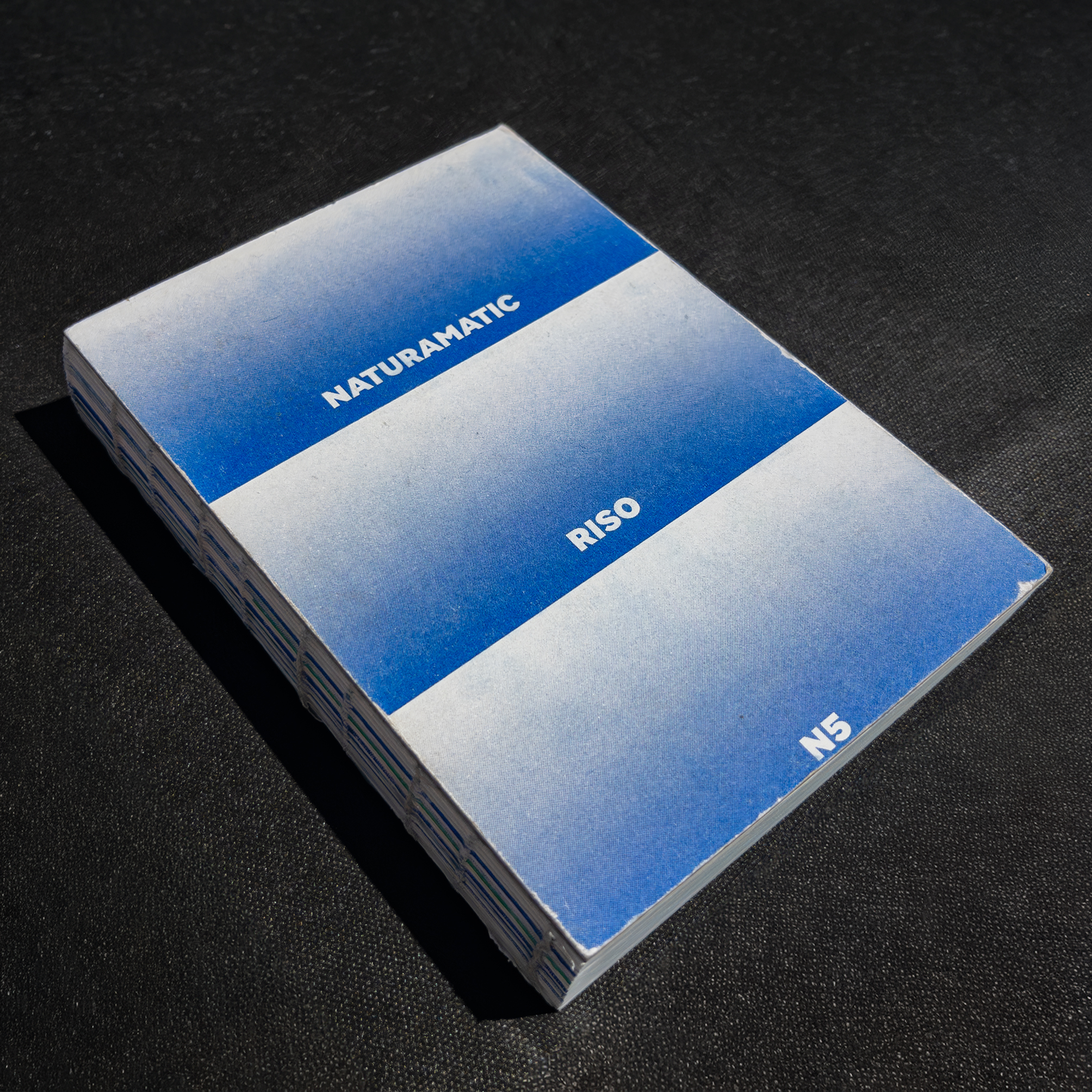
Naturamatic
Editorial Design
2024/25
~ 4 months
team project
Client:
RUFA (Rome University of Fine Arts)
Details:
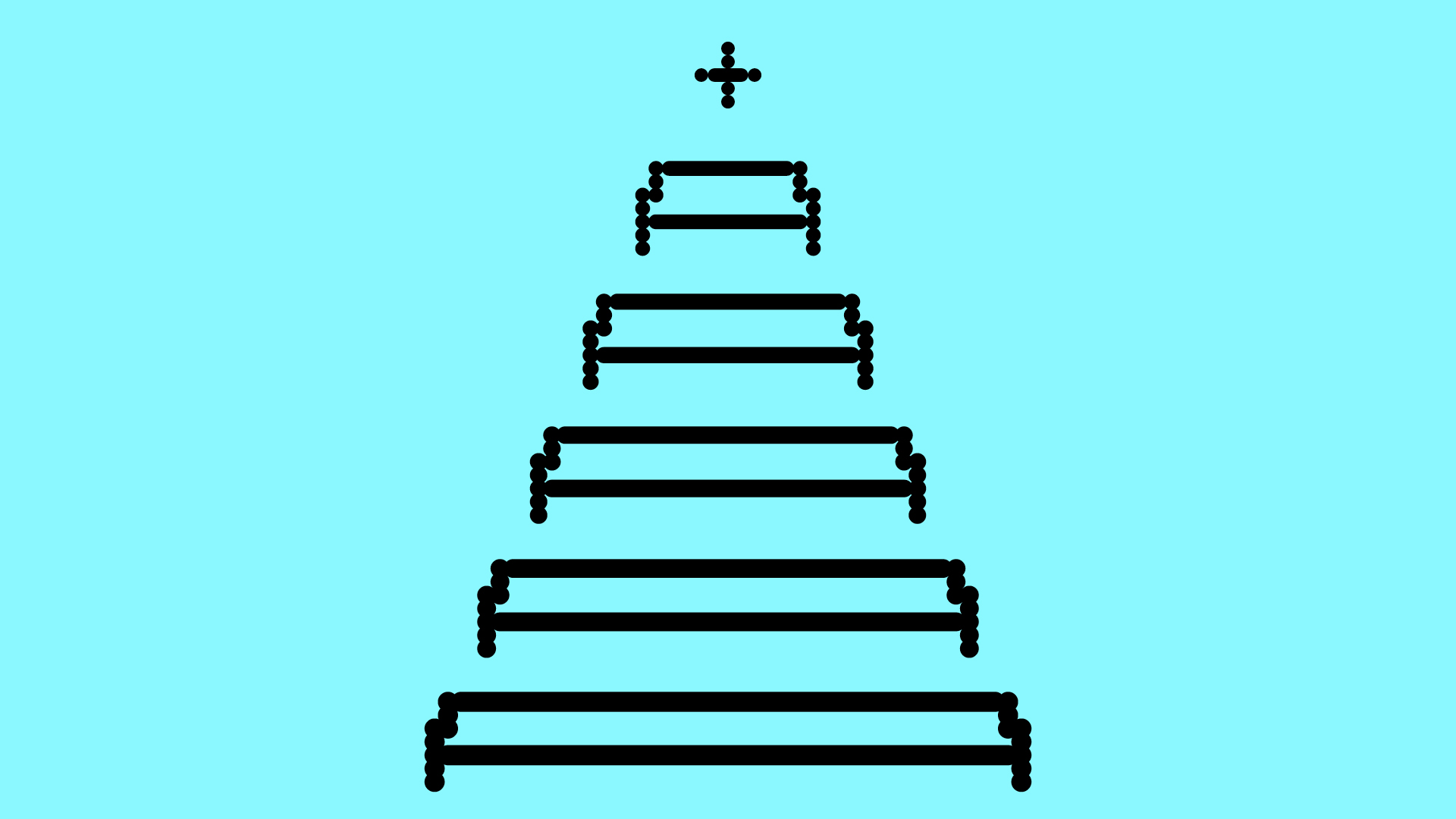
I collaborated with a small group of classmates to create Naturamatic, a collective project developed during the Design Methodology course at RUFA, involving all classes. Our team designed a sixteenth of the booklet that blends artworks and song lyrics into a continuous visual narrative. Each page shows the tide rising, gradually flooding the layout until it fully submerges the final spread.

DOTTIE
type design
2025
1 week
Client:
RUFA (Rome University of Fine Arts)
Details:
Dottie is a modular variable font designed during a type design workshop at RUFA in collaboration with Stefano and Giulio from CAST TypeFoundry. The typeface is built entirely from circular dots and rounded rectangles and assembled within a modular grid.

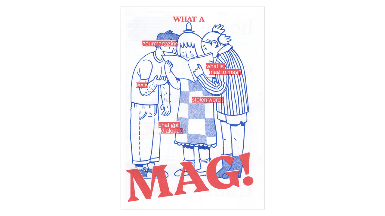
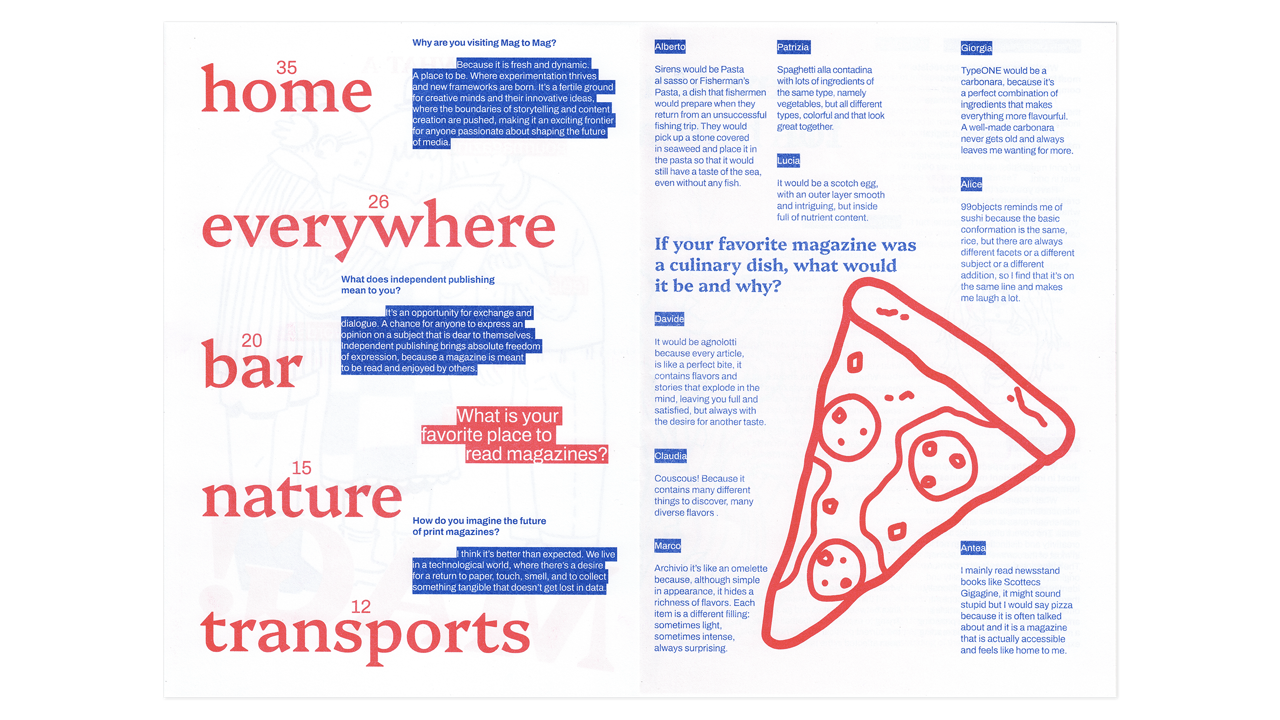
What a MAG! Zine
editorial design
2024
1 week
team project
Client:
Mag to Mag
Details:
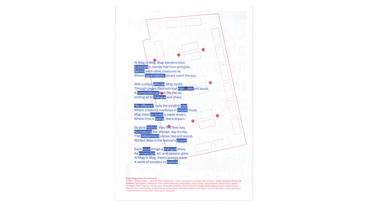
Together with around 30 other RUFA students I took part in a group project during the Mag to Mag festival in Milan. Guided by our professors and by Greek designer Natassa Pappa, we worked in teams to create an instant-zine in just over 10 hours, capturing the festival’s energy in A4 format.
Once printed, we folded and distributed the zines throughout the whole venue. It was an intense experience that mixed teamwork and creativity under tight deadlines.
Once printed, we folded and distributed the zines throughout the whole venue. It was an intense experience that mixed teamwork and creativity under tight deadlines.
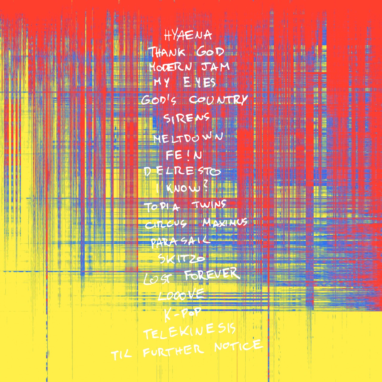
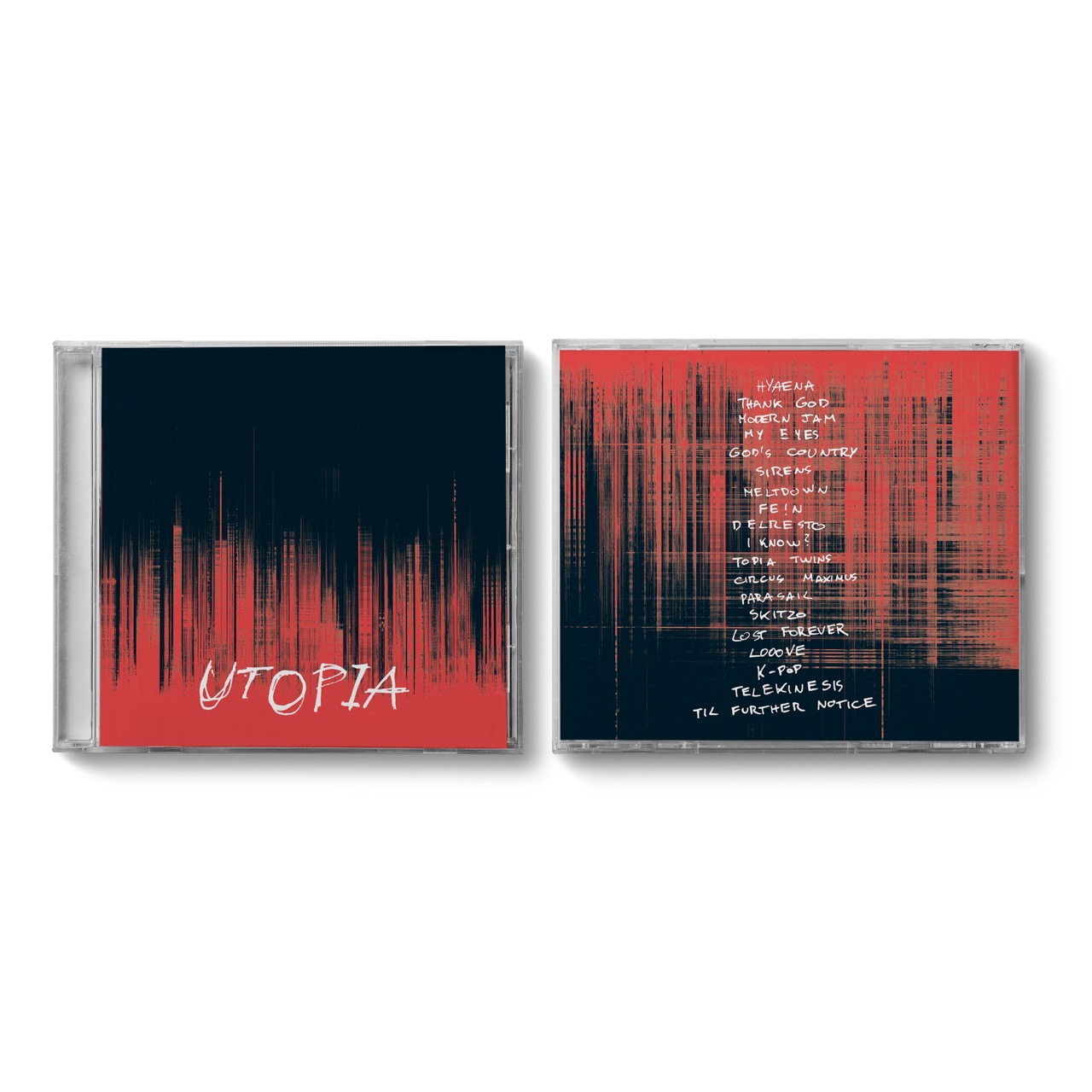
UTOPIA cover redesign
brand/editorial design
2024/25
~ 4 months
Client:
RUFA (Rome University of Fine Arts)
Details:
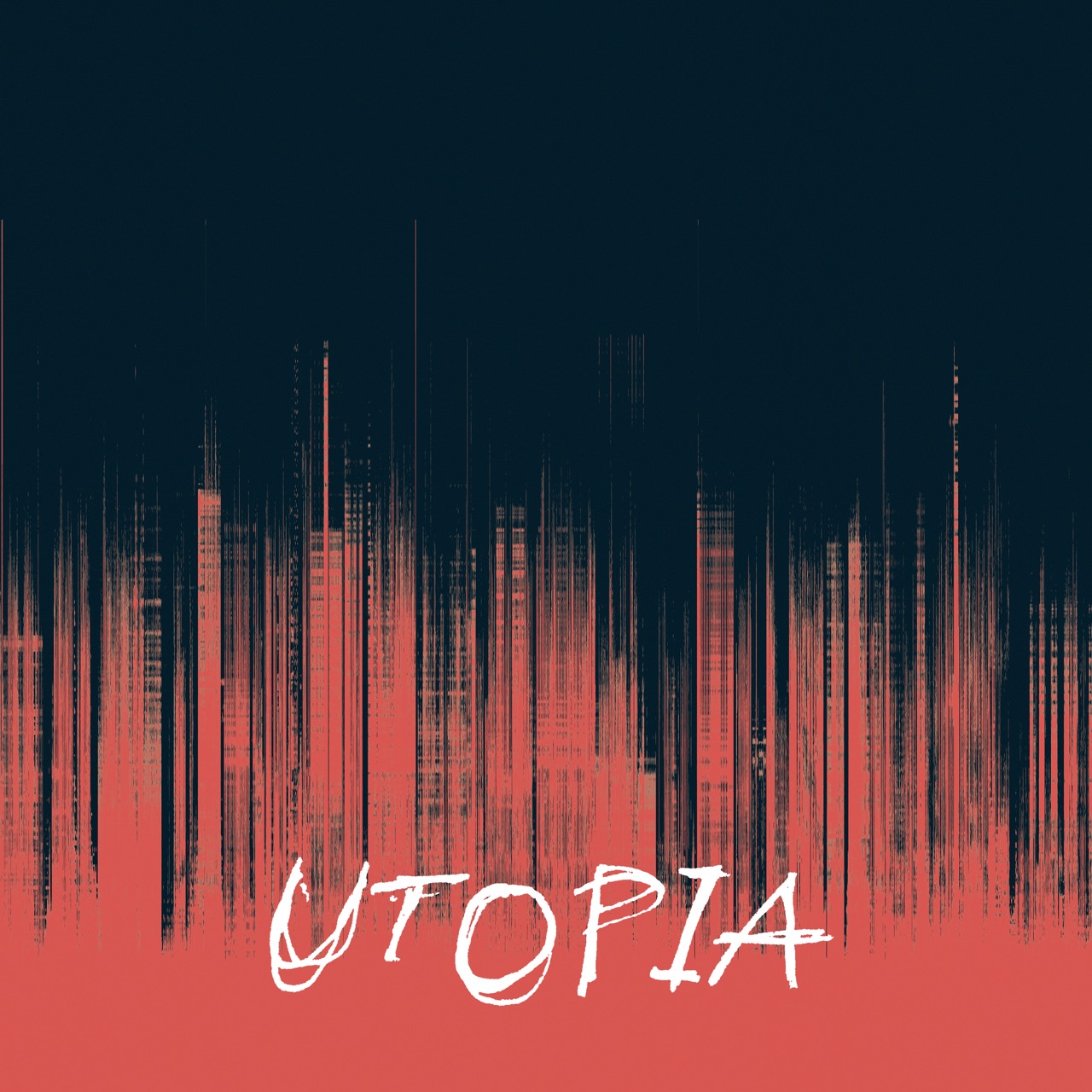
The goal was to translate the sonic complexity of Utopia into a visual experience. The cover becomes an extension of the album itself, turning its diverse musical traits into graphic elements.
I used spectrograms to visualize sounds and frequencies. The combination of handwritten text and sans-serif typography enhances the contrast between structure and experimentation.
I used spectrograms to visualize sounds and frequencies. The combination of handwritten text and sans-serif typography enhances the contrast between structure and experimentation.


Kinetic Type Tarantino
Motion design
2024/25
~ 3 months
Client:
RUFA (Rome University of Fine Arts)
Details:
During the motion design course at RUFA I explored kinetic typography by animating text to enhance its narrative impact and storytelling. My project is based on "Once Upon a Time in Hollywood" by Tarantino. I experimented to mirror the distinctive mood of Tarantino's film. This work allows typography to become an extension of the story.


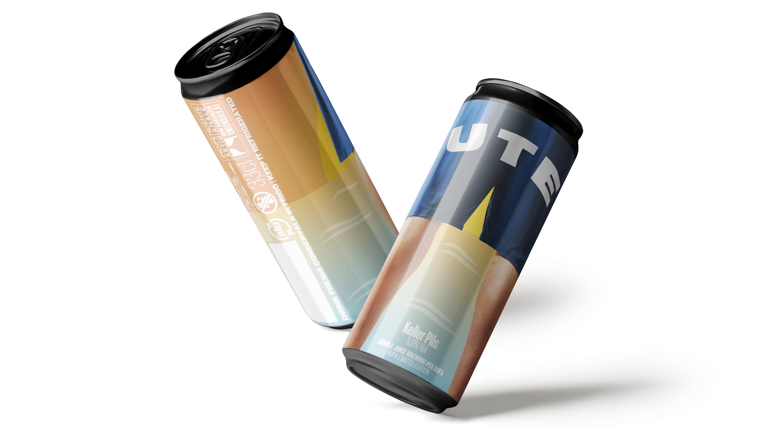
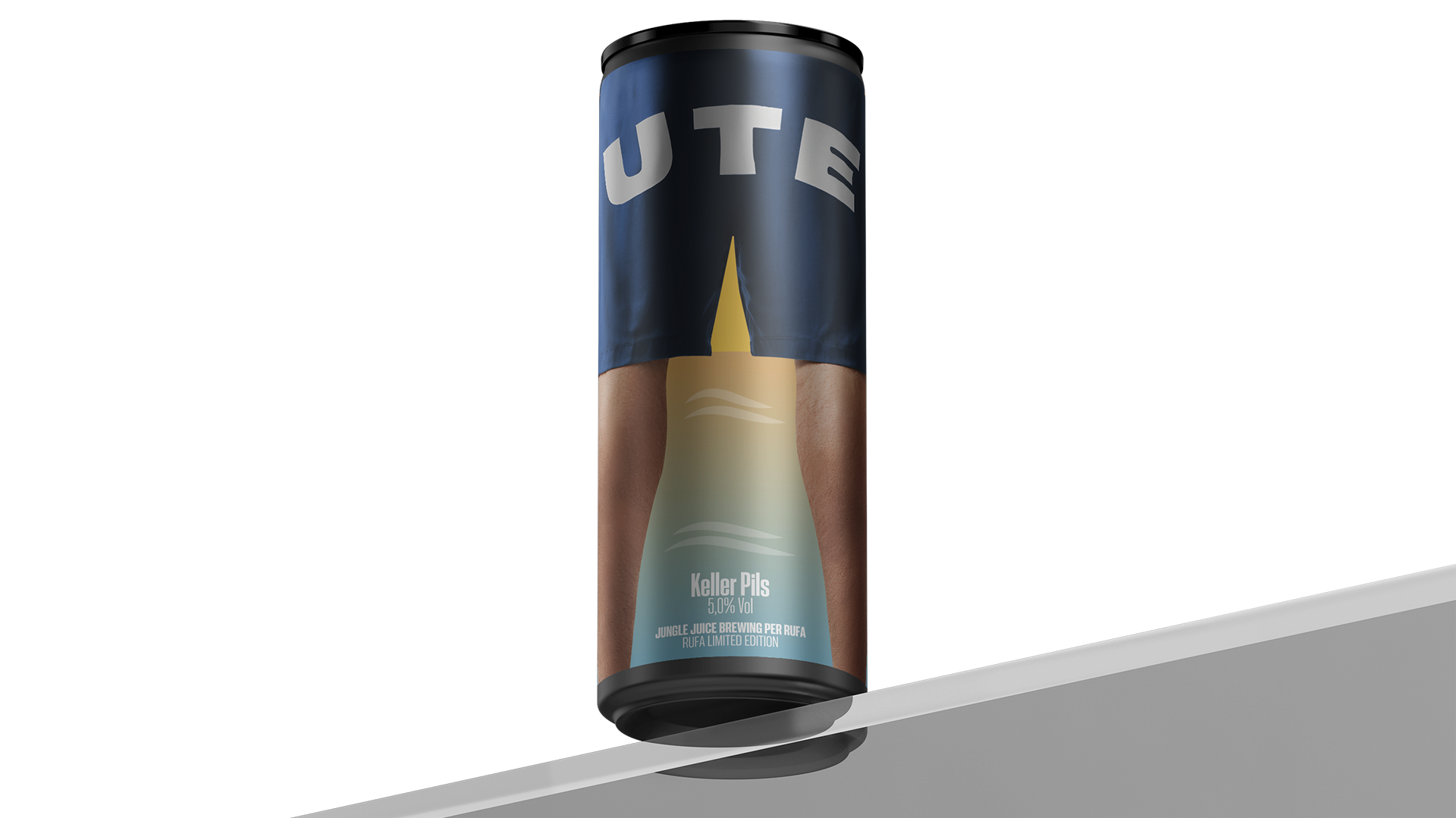
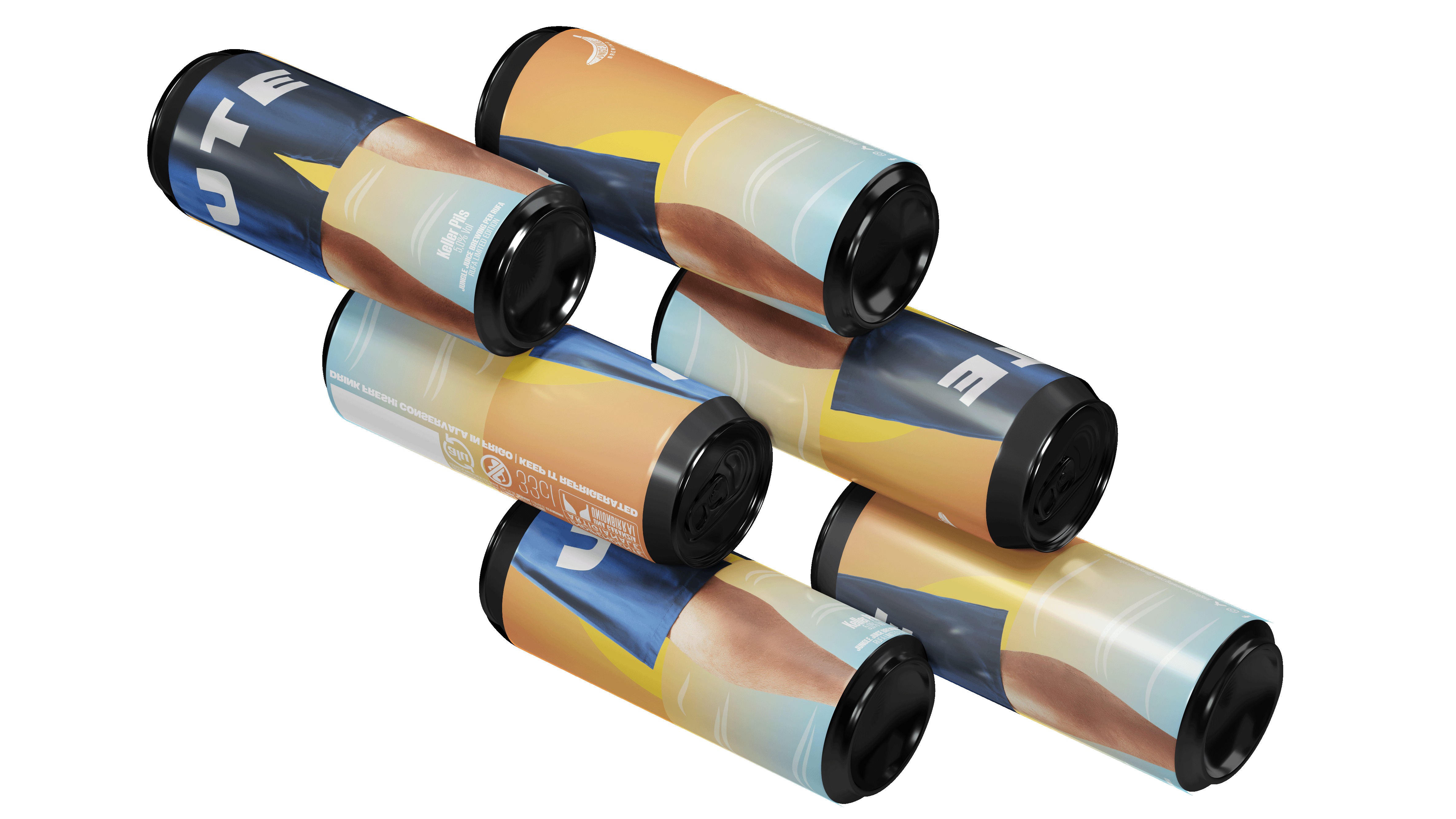
UTE Limited edition
packaging design
2024/25
~ 5 months
Client:
RUFA (Rome University of Fine Arts) x Jungle Juice Brewing
Details:
As part of a collaborative project between RUFA and Jungle Juice brewery I designed both the can and the 12-pack box for UTE, a Keller Pils beer. The concept reflects the beer’s easygoing and summery vibes through a playful visual. The can shows a man seen from behind, standing at sunset. The most visible detail is the word "UTE" written across the back of his swim trunks. The artwork combines vector art and photography. For the box I was inspired by classic ice boxes.

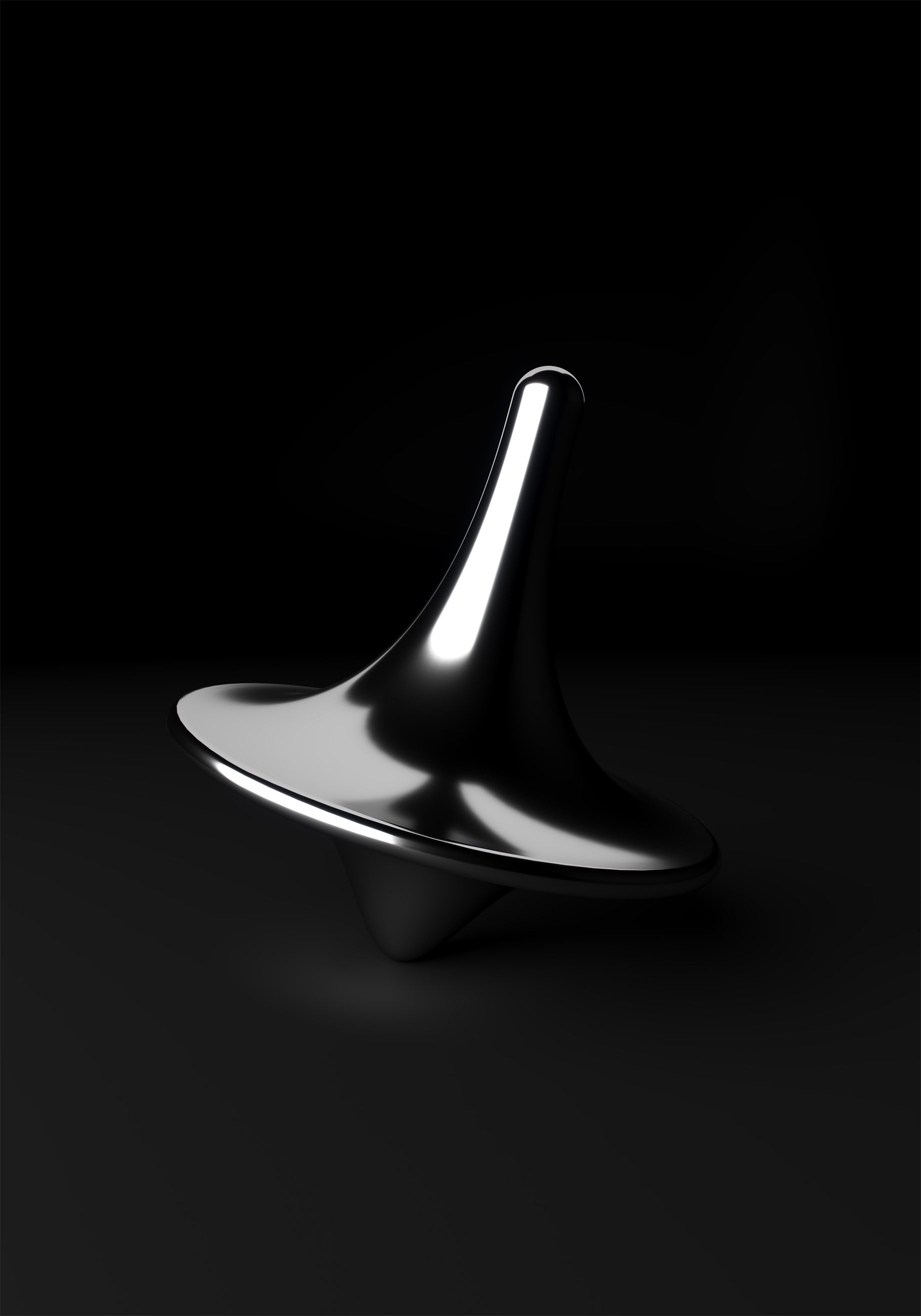
inception intro
3d modeling + motion design
2025
~ 5 months
Client:
RUFA (Rome University of Fine Arts)
Details:
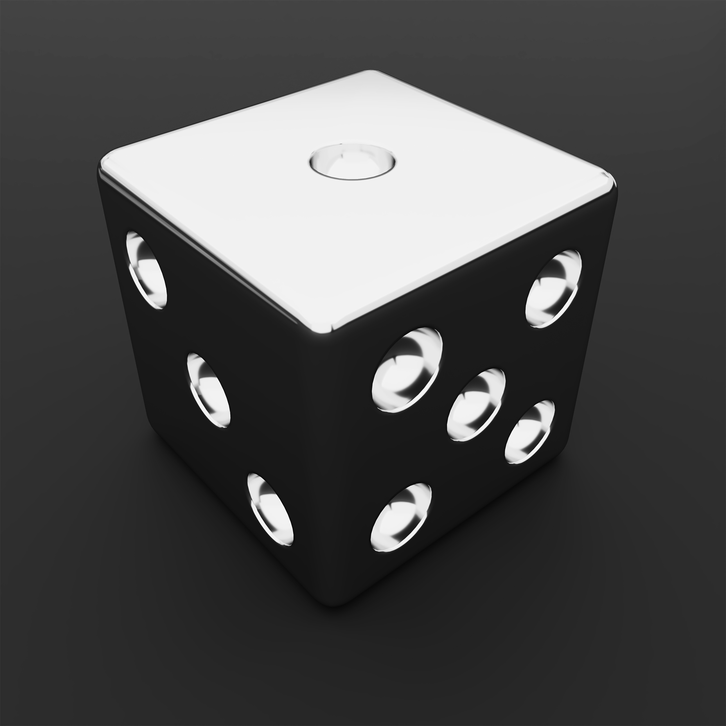
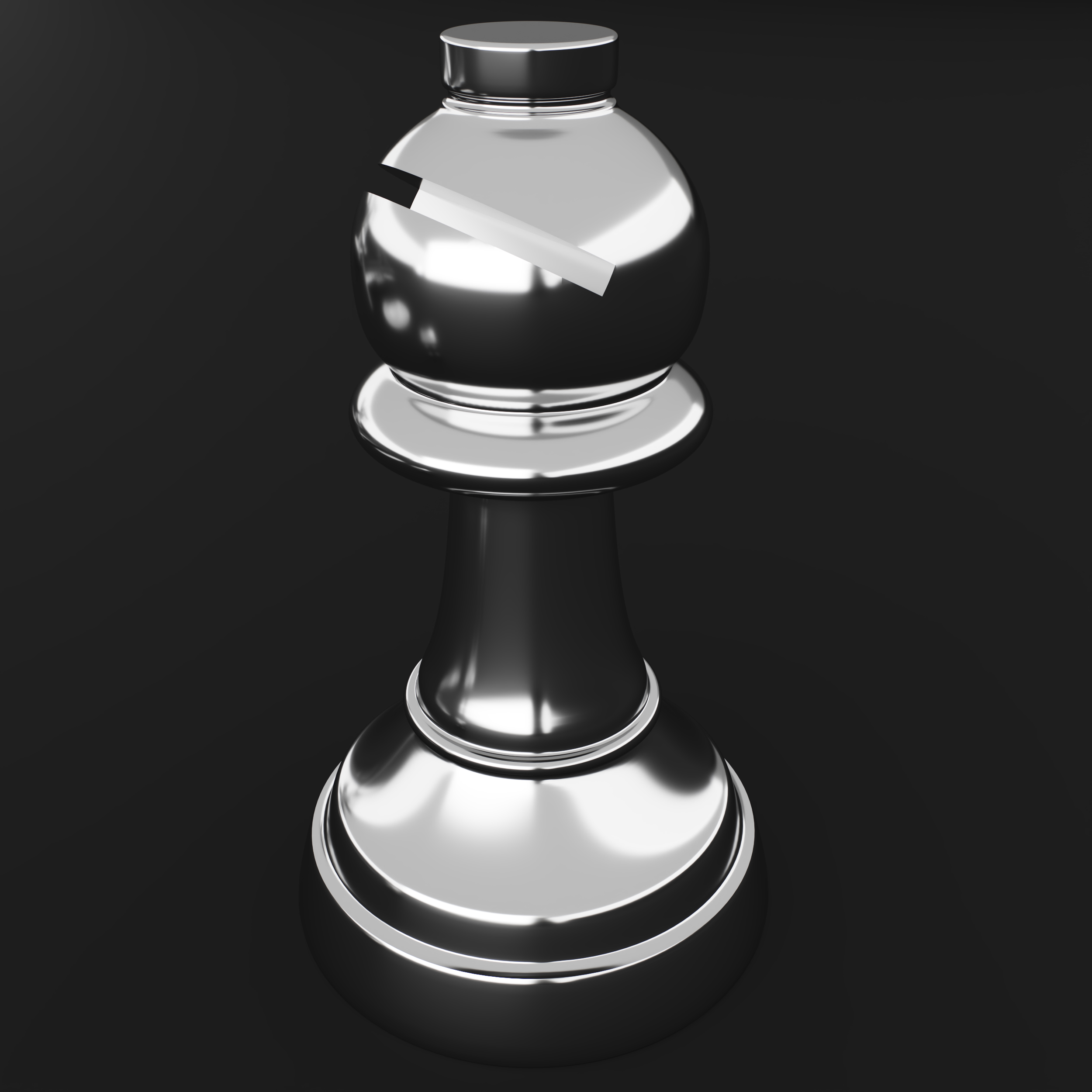
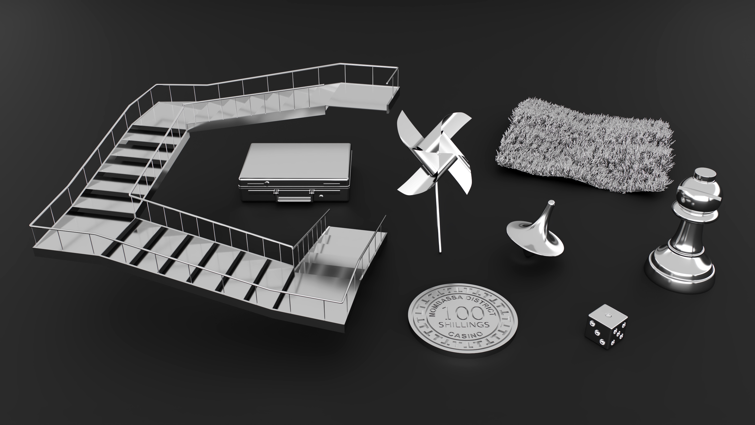
During the 3D Modeling course at RUFA, I learned how to use 3ds Max and deepened my understanding of polygonal modeling techniques. For the final project, I recreated a series of iconic props from Christopher Nolan’s Inception, focusing on each character’s totem. I modeled every object with attention to form, scale and detail, staying faithful to the original design. Later, I brought the models into After Effects, where I animated them for my motion design final exam. The outcome was a conceptual intro for Inception, where each totem appears in motion to evoke the suspended, dreamlike tone of the film. The project was an exercise in combining precision, storytelling and visual rhythm through 3D modeling and animation.
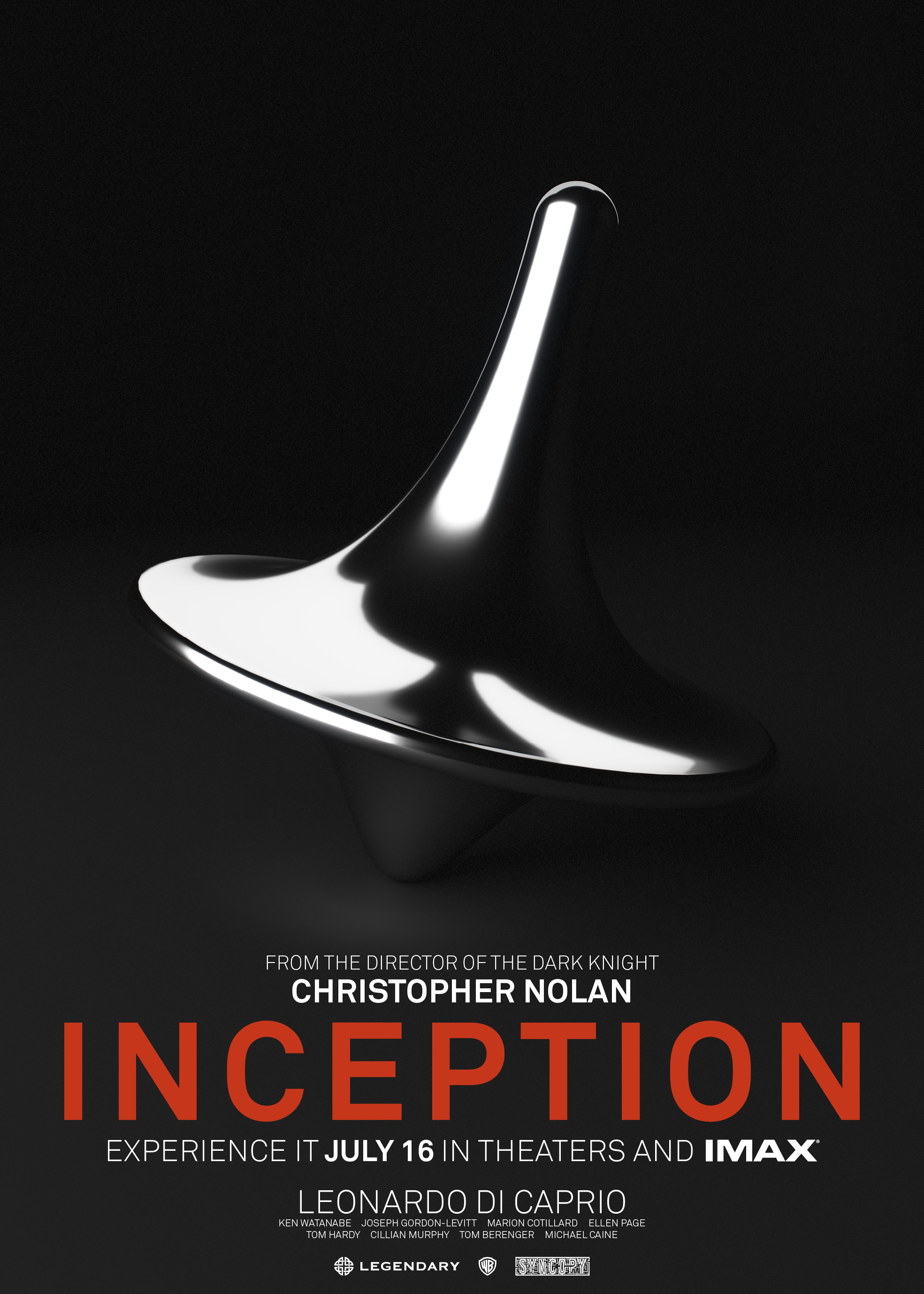
To complete the project, I also designed a launch poster for the movie, aiming to visually translate the film’s themes of duality, time and perception through layout, typography and atmosphere. The project was an exercise in combining precision, storytelling and visual rhythm through 3D modeling, motion graphics and graphic design.
To complete the project, I also designed a launch poster for the movie, aiming to visually translate the film’s themes of duality, time and perception through layout, typography and atmosphere. The project was an exercise in combining precision, storytelling and visual rhythm through 3D modeling, motion graphics and graphic design.